- Home
- Painting Terms
Painting Terms
Your Handy Glossary
A glossary of painting terms is such a useful list to have on hand.
These are some of the terms that I and other teachers may use in instructional materials or in a classroom / workshop setting that you need to understand. It's sort of like learning a new language.
I'm presenting the terms in alphabetical order to make it easy for you to refer to when needed.
It's a growing list so if you come across a term not covered here, let me know and I'll add it. I'd be very grateful for your contribution.
ACRYLIC PAINT
Acrylic paints are made up of color pigments which are suspended
in an acrylic polymer emulsion. They
are water soluble however once they're dry they're water-resistant. Acrylics dry quickly.
BASECOAT
To basecoat is to lay the first color down in a specific
area prior to shading and highlighting.
DIRTY BRUSH
When you add another color of paint to a brush that already
has remnants of the previous color.
Blending the two will create a new color.
DISTRESS
This is done to re-create an antique or aged look once the
painting is finished. Most effective on
metal or wood where you would use sand paper to create worn areas, getting down
to the bare wood or metal.
DOUBLE-LOADING
Using a Flat brush, load one corner into one puddle of
paint, flip the brush over and load that corner into another puddle of
paint. You want to ensure that the two
colors meet in the middle. Place the brush down on your palette and stroke the
hairs back and forth until the two colors blend nicely together.
DRY-BRUSHING
For this technique there is no water in the brush and very
little paint. Applying just a little
pressure you can create lovely highlights and tints.
FLOATING
This is used extensively to create shadows and highlights.
First the Flat brush is moistened with water and lightly blotted. One corner of the brush is then loaded into paint. The paint is then blended on the palette to encourage the color to move across the hairs, fading as it goes. The idea is to have intense color on one side to no color on the other side with gradation in between.
FLY SPECKING
Love doing this for creating snowy scenes or to add
drama. Make an inky-consistency puddle
of paint and water. Place the bristles
of an old toothbrush into the puddle.
Blot a little on piece of paper towel.
Now run your thumb toward yourself with the bristles pointing down at
the painting. This is fun to do but you
need to practice getting the consistency of the paint just right, otherwise you
can end up with big blobs rather than spatter.
So always do a practice run first.
You can also load a long liner into the puddle and tap the handle on an other brush handle to encourage spatters. Again, practice first.
Let's continue on with these painting terms...
HIGHLIGHTING
This is when you create a brighter or lighter area in the
painting. This can be achieved using
techniques like floated color, stippling and dry-brushing.
INKY CONSISTENCY
To make your acrylic paint more inky renders it more fluid.
Add a small puddle of water to your palette and mix in a little paint. About 80% water and 20% paint. Usually we thin down our paint to an inky
consistency when we're doing liner work such as fine scrolls and tendrils. I like to tell my students that the paint
should be like full fat milk rather than skim milk. That usually does the trick!
HUE
A hue is a color. Also means the
same as tint, shade and tone.
"That's a lovely shade of Green." "I love that tint of Lilac." "That Red tone is so rich." "My favorite hue is Blue." "My favorite color is Blue." There's often confusion around these terms so I just wanted to
clear things up for you.
That was always one of those painting terms I couldn't wrap my mind around!
LAYERING
Layering simply means applying multiple layers of
paint. This can be achieved with a
variety of techniques with the idea being that each previous color is used to
build up a new final color that is rich and deep.
LINE DRAWING
Most instructional painting material, like books and pattern
packets will provide you with a line drawing to work from.
LOADING
When you load a brush with paint it just means you're
scooping up some paint on your brush.
PALETTE
A painter's palette is used to hold paint and it's also
where the paint brush is dressed by loading it in the paint and blending the
hairs on the smooth surface. Most
decorative painters use a disposable paper palette. The paper is waxy and smooth on one side. It can be wiped down and re-used several
times. When done, tear if off and use a
fresh sheet. TIP: Keep the paper in the pad to give the paper
some weight and stability as you work the paint into the hairs of the brush. Loose sheets just slide all over your work
surface.
Palette also means an arrangement of colors.
And there are still more painting terms....
SHADING
To darken an area.
This can be done using a variety of techniques, like floating and dry
brushing.
SIDELOAD
As described above in "floating". One corner of the Flat brush is loaded in
paint and blended on the palette.
STIPPLING
To pounce a brush up and down to create a stippled
effect. This is typically achieved
using a Deerfoot or other stiff bristle brush.
Can be done with just a little paint or lots of paint depending on the
desired effect.
STYLUS
A tool made up of a wood handle with a metal point at one or
both ends. Used for going over line
drawings to transfer them to the painting surface. Also handy for making little paint dots.
TINTING
This is just a hint of color often used to suggest the reflection of a nearby color. An example would be how a cherry might
reflect a little bit of hue, red in this case, onto a white table cloth or a
nearby green leaf.
TRANSFER or GRAPHITE PAPER
This is similar to carbon paper. It's used to transfer a line drawing onto the surface to be painted.
TRACING PAPER
A semi transparent lightweight vellum paper which allows you
to trace out a pattern or line drawing or sketch so that it can be positioned
onto your painting surface. Ideally you
tape it in place and then slide the graphite paper underneath, sandwiching it
between the painting surface and tracing paper. Use a stylus to go over the line drawing to transfer the design.
WASH
This is a thinned down paint color which is thinner than
inky consistency as described above.
Start with a little water on the palette and add a little paint. The water should be lightly saturated with
the paint so that when you apply it remains transparent and your background
color and / or details stay visible.
Here's what I mean.... if I have a white background with a black design on it and I apply a wash of red, the canvas will be a soft pink and the black will remain very visible. If I add another wash of red the background will become more pink and the black still very visible. If I add a wash of yellow now my canvas will take on a transparent orange hue while still allowing the black deign to show through..
WET-ON-WET
Simply explained, it's just the blending of colors on an already wet background.
For now I think that's it for the glossary of painting terms!
Let's go from painting terms back to the HOME page.
You Can Paint These Trees and More
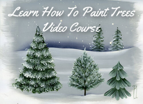
Get Your Video Course Now
Introductory Price
Save 30% plus
a Money Back Guarantee


You Can Paint These Trees and More
Get Your Video Course Now
Introductory Price
Save 30% plus
a Money Back Guarantee
Recent Articles
-
Earmark decorative painting studio in Ottawa! A cozy place to paint.
May 02, 26 03:28 PM
 Earmark decorative painting studio is a very comfortable and relaxing studio and classroom catering to all painting levels.Located in rural, scenic Ottawa.
 -
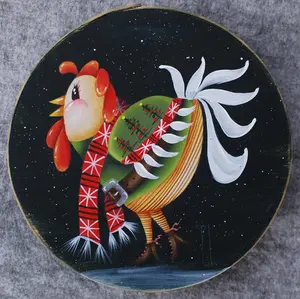
CBP0012 Funky Winter Chicken
Apr 14, 26 03:18 PM
 You'll get your funky dance on with my Funky Winter Chicken e-Pattern Packet. Detailed step-by-step instructions, line drawings, pictures and materials ensure your success with this project.
 -
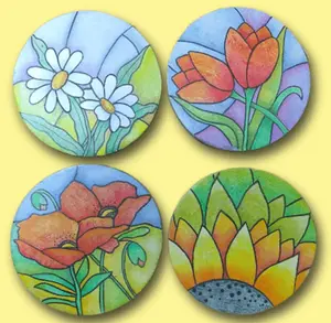
CBP0045 Stained Glass Coasters Pattern Packet
Apr 14, 26 03:16 PM
 This faux Stained Glass Coasters Pattern Packet will provide you with hours of fun creating and using these coasters.
 -
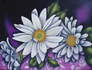
CBP0005-Daisies at Dusk
Apr 14, 26 03:06 PM
 We all love daisies and you will love painting Daisies at Dusk. This decorative painting e-packet also known as a tole painting e-pattern has detailed step-by-step instructions, lots of pictures, mate…
 -
CBP0004-Get-Crackin
Apr 14, 26 03:03 PM
 Here's Get-Crackin, an advanced, trompe loeil pattern packet. You will love the results you get. Detailed step-by-step instructions and lots of pictures.
 -
CBP0002-hey-tiger
Apr 14, 26 02:57 PM
 CBP0002-hey-tiger is a beautiful Eastern Tiger Swallowtail butterfly
 -
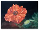
CBP0028-High Realism Poppy Pattern Packet
Apr 14, 26 02:49 PM
 Enjoy CBP0028-High Realism Poppy Packet. This project is guaranteed to please. Settle into a quiet place, add layers and watch this poppy come alive.

Site Search
| site search by freefind | advanced |
You Can Paint These Trees and More
Get Your Video Course Now
Introductory Price
Save 30% plus
a Money Back Guarantee