- Home
- Glass Paint
- Glass Painting Designs
Glass Painting Designs
Beautiful Ideas
That Actually Work on Glass

Searching for glass painting designs, you might be picturing anything from wine glasses and decorative bottles to window art, mirrors, or even peelable clings. Different projects, sure… but they all share one challenge: the surface.
Glass isn’t paper, wood, or canvas. It’s slick and smooth, reflects light, and lets light pass straight through, changing how every design behaves depending on the lighting. What looks great while you’re painting it flat on a table might look completely different once it’s hanging in your window.
So rather than throwing random patterns at you, let’s explore designs that are created with glass in mind and why they work so beautifully.
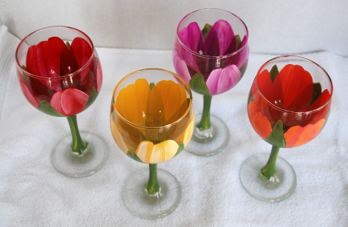
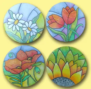
NOTE: Instructional pattern packet for the design featured at the top of this page can be found here.
What Makes a Glass Painting Design Successful?
Before you pick up a brush, pause and think about how the surface will influence your choices.
Here are four things I always consider:
1. Light Changes Everything
Backlit glass makes color glow. The same piece lying flat on your table will look dull by comparison.
If the finished project hangs in a window, transparent paints will give you that luminous effect. If it’s going on a wall, opaque enamels may be the better choice.
Always design for where the piece will reside when completed.
2. Edges Become Structural
On glass, outlines aren’t just decorative, they create containment.
When using relief outliners, every shape must be fully enclosed. Even the tiniest gap can let paint bleed into other “cells”. Closed shapes give you clean fills and predictable results.
3. Order Matters (Sometimes It’s Backwards!)
Painting on the back of framed glass means working in reverse.
Fine details and lettering go down first. Backgrounds come last. It feels counterintuitive at first but the finished result is stunning. Reverse glass painting is typically done with opaque enamels and is designed to be viewed from the front only.
4. Function Guides the Layout
Design decisions should always reflect how the piece will be used.
Painting wine glasses? Leave the rim clear for safety.
Designing coasters? Keep the main detail toward the outer edges so a mug
doesn’t hide your work.
Planning a window panel? Consider visibility from both sides and choose
transparency accordingly.
Beautiful glass painting designs are thoughtful about real-life use.
Popular Types of Glass Painting Designs
Different objects call for different approaches. These are the styles decorative painters return to again and again.
1. Stained-Glass Style Designs
(Perfect for bottles, sun catchers, and windows)
These designs rely on bold outlines that divide the image into small “cells,” which are then filled with transparent or semi-transparent color.
Why they work:
- The outline organizes the composition
- Color stays neatly contained
- The structure makes them approachable even for beginners
Design tip: Always close every shape when working with relief outliners. Tiny breaks can lead to messy bleeds.
2. Peelable Window Designs (“Peelies”)
(Great for seasonal or temporary décor)
Peelable glass paint allows you to create removable designs that cling to windows.
These work best when they include:
- Clear silhouettes
- Strong, confident outlines
- Simplified details
3. Functional Decorative Pieces
(Coasters, vases, wine glasses, bottles)
When the piece serves a purpose, the design strategy shifts slightly.
Coasters:
Borders, repeating motifs, and outer-edge designs work well since a cup will
cover the center.

Vases:
Tall surfaces love vertical movement. Vines, florals, and elongated patterns feel natural.
Drinkware:
Plan for a “front” view and a “back” view or design a full wraparound pattern.
4. Bold Graphic & Text-Based Designs
(Perfect for gifts and personalized pieces)
Lettering, stars, swirls, and simple icons are incredibly popular for celebrations and custom gifts.
Why they succeed:
- Words pop on glass because the solid paint sits against all that clear, glowing space
- Small motifs adapt well to curved surfaces
- Repetition makes freehand work feel intentional
How to Choose the Right Glass Painting Design

Before settling on a pattern, ask yourself:
Where will it be displayed?
Window pieces need translucency and strong readability. Shelf pieces can handle
finer detail.
Will it be viewed from one side or both?
Balanced compositions and clean outlines matter more when both sides are
visible.
Is the surface flat or curved?
Curved glass can subtly distort straight lines. This can either be a problem
or a creative choice.
What finish are you aiming for?
Transparent, frosted, or opaque? Your design should support the effect you want
to achieve.
Practical Tips That Elevate Even Simple Designs
A few thoughtful adjustments can make even the simplest pattern look polished:
- Work in clusters (large, medium, small elements)
- Use borders intentionally
- Plan your negative space...clear glass is powerful
- Test your design at full size before painting
- Tape guides inside or behind the surface to check placement
Glass already provides brightness. You don’t have to cover every inch.
Final Thoughts on Glass Painting Designs
The most successful glass painting designs aren’t just attractive — they’re intentional.
They consider light. They respect the surface. They reflect how the object will be used. And most importantly, they’re joyful to create.
Once you understand how design behaves on glass, you stop fighting the surface and you start partnering with it.
And that’s when the magic really happens.

I hope this was of value to you. Feel free to scroll down to the bottom of this page and let me know.
If you enjoyed the information and ideas here, imagine how much more you could learn and enjoy in my Earmark Creative Studio online community. It's filled with everything to make you a better painter. You'll find Video Tutorials and Projects, How To Techniques videos, Live and recorded events, Monthly projects and challenges.
Click HERE to learn more about how you can become the painter of your dreams at Earmark Creative Studio.
I'd love to hear from you. Pour yourself a nice cup of coffee and drop me a line.
Speaking of coffee... I love mine black. If you'd like to treat me, you can buy me a coffee by clicking here. I'd really appreciate it. Thanks.
Want some more glass painting designs? Drop me a line and let me know what you'd like me to design for you! Contact me here.
Want to paint a fancier set of wine glasses? My video course will take you step-by-step!
Let's get back to the HOME page.
You Can Paint These Trees and More
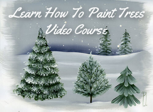
Get Your Video Course Now
Introductory Price
Save 30% plus
a Money Back Guarantee


You Can Paint These Trees and More
Get Your Video Course Now
Introductory Price
Save 30% plus
a Money Back Guarantee
Recent Articles
-
Earmark decorative painting studio in Ottawa! A cozy place to paint.
May 02, 26 03:28 PM
 Earmark decorative painting studio is a very comfortable and relaxing studio and classroom catering to all painting levels.Located in rural, scenic Ottawa.
 -
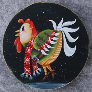
CBP0012 Funky Winter Chicken
Apr 14, 26 03:18 PM
 You'll get your funky dance on with my Funky Winter Chicken e-Pattern Packet. Detailed step-by-step instructions, line drawings, pictures and materials ensure your success with this project.
 -
CBP0045 Stained Glass Coasters Pattern Packet
Apr 14, 26 03:16 PM
 This faux Stained Glass Coasters Pattern Packet will provide you with hours of fun creating and using these coasters.
 -
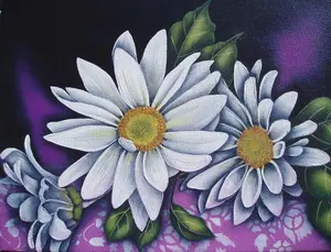
CBP0005-Daisies at Dusk
Apr 14, 26 03:06 PM
 We all love daisies and you will love painting Daisies at Dusk. This decorative painting e-packet also known as a tole painting e-pattern has detailed step-by-step instructions, lots of pictures, mate…
 -
CBP0004-Get-Crackin
Apr 14, 26 03:03 PM
 Here's Get-Crackin, an advanced, trompe loeil pattern packet. You will love the results you get. Detailed step-by-step instructions and lots of pictures.
 -
CBP0002-hey-tiger
Apr 14, 26 02:57 PM
 CBP0002-hey-tiger is a beautiful Eastern Tiger Swallowtail butterfly
 -
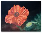
CBP0028-High Realism Poppy Pattern Packet
Apr 14, 26 02:49 PM
 Enjoy CBP0028-High Realism Poppy Packet. This project is guaranteed to please. Settle into a quiet place, add layers and watch this poppy come alive.

Site Search
| site search by freefind | advanced |


You Can Paint These Trees and More
Get Your Video Course Now
Introductory Price
Save 30% plus
a Money Back Guarantee